Leap Motion (USER MODULE)
Receive data from a leap motion external device.
Official Leap Motion Docs
The module is organized in five sections :
- general: global actions and info's
- hands: deliver hands data
- palms: deliver palms data
- fingers: deliver fingers data
- gestures: deliver gesture data
Each data sections can be Enabled/Disabled to optimize performance and cpu load
About units of data delivered :
- All positions are normalized, so coordinates go from 0 to 1 inside the interaction box
- All directions and normals values go from -1 to 1
- All velocities are in millimeters/seconds
Settings
General section
on
Connect the module to the leap motion.
connected
ON if the connection is confirmed.
zoom
2 modes:
- one hand: corresponding to the interaction box as the leap provide it to the module.
- two hands: the interaction box volume is doubled to make two hands tracking easy.
frame id
Frame number of the leap motion, useful to check if we miss some frames.
hands section
See LeapMotion.com : hand attributes for more infos about data definition.
Spheres parameters describe a sphere that is placed and sized to fit into the curvature of the hand.
-
num hands: Number of hands detected by the leap motion.
-
enable hands: Enable the hands section data tracking, each array of this section will have the size of the number of hands mentioned below, ie. 1 or 2.
-
hands id: Id of each hands, it's a unique number identifying each hand and stay the same as long as the hand is tracked.
-
hands num fingers: Number of fingers detected for each hand.
-
spheres pos x: The x position coordinate of the sphere.
-
spheres pos y: The y position coordinate of the sphere.
-
spheres pos z: The z position coordinate of the sphere.
-
spheres radius: The radius (in millimeter) of the sphere.
-
hands valid: Validity indicator(0 or 1) for hands params provided by the leapmotion driver.
palms section
See LeapMotion.com : hand attributes for more info's about data definition.
-
enable palms: Enable the palms section data tracking, each array of this section will have the size of the number of hands mentioned below.
-
palms hands id: Id of each hands, it's a unique number identifying each hand and stay the same as long as the hand is tracked.
-
palms pos x: The x position coordinate of the palm.
-
palms pos y: The y position coordinate of the palm.
-
palms pos z: The z position coordinate of the palm.
-
palms dir x: The x direction vector of the palm.
-
palms dir y: The y direction vector of the palm.
-
palms dir z: The z direction vector of the palm.
-
palms vel x: The x velocity of the palm.
-
palms vel y: The y velocity of the palm.
-
palms vel z: The z velocity of the palm.
-
palms nor x: The x normal vector of the palm
-
palms nor y: The y normal vector of the palm
-
palms nor z: The z normal vector of the palm
-
palms valid: Validity indicator(0 or 1) for palms parameters provided by the leap motion driver.
fingers section
See LeapMotion.com : finger and tool models for more info's about data definition.
-
num fingers: Number of total fingers detected (including all hands), can detect up to twenty fingers.
-
enable fingers: Enable the fingers section data tracking, each array of this section will have the size of the number of fingers mentioned below.
-
fingers id: Id of each fingers, it's a unique number identifying each finger and stay the same as long as the finger is tracked.
-
fingers hand id: Id of each fingers hand, it's a unique number indicating each finger's hand and stay the same as long as the finger is tracked.
-
fingers pos x: The x position coordinate of the finger.
-
fingers pos y: The y position coordinate of the finger.
-
fingers pos z: The z position coordinate of the finger.
-
fingers dir x: The x direction vector of the finger.
-
fingers dir y: The y direction vector of the finger.
-
fingers dir z: The z direction vector of the finger.
-
fingers vel x: The x velocity of the finger.
-
fingers vel y: The y velocity of the finger.
-
fingers vel z: The z velocity of the finger.
-
fingers length: The radius (in millimeter) of the finger.
-
fingers is tool: is this finger considered as tool (0 or 1).
-
fingers valid: Validity indicator(0 or 1) for fingers parameters provided by the leap motion driver.
gestures section
See LeapMotion.com : gestures for more info's about gestures definition.
enable gestures
Enable the gestures data tracking.
gesture
Gesture detected by the leap motion provided in an array.
Description               ID   data1         data2          data3           data4          data5          data6         data7          data8             data9          data10          data11
swipe left                200  start pos X   start pos Y    start pos Z     stop pos X     stop pos Y     stop pos Z    duration       pointable id      direction X    direction Y     direction Z
swipe right               201  start pos X   start pos Y    start pos Z     stop pos X     stop pos Y     stop pos Z    duration       pointable id      direction X    direction Y     direction Z
swipe up                  202  start pos X   start pos Y    start pos Z     stop pos X     stop pos Y     stop pos Z    duration       pointable id      direction X    direction Y     direction Z
swipe down                203  start pos X   start pos Y    start pos Z     stop pos X     stop pos Y     stop pos Z    duration       pointable id      direction X    direction Y     direction Z
swipe forward             204  start pos X   start pos Y    start pos Z     stop pos X     stop pos Y     stop pos Z    duration       pointable id      direction X    direction Y     direction Z
swipe backward            205  start pos X   start pos Y    start pos Z     stop pos X     stop pos Y     stop pos Z    duration       pointable id      direction X    direction Y     direction Z
circle clockwise          206  center pos X  center pos Y   center pos Z    radius         progression    duration      pointable id   normal X          normal Y       normal Z
circle counterclockwise   207  center pos X  center pos Y   center pos Z    radius         progression    duration      pointable id   normal X          normal Y       normal Z
key tape                  208  pos X         pos Y          pos Z           duration       pointable id
screen tape 209 pos X pos Y pos Z duration pointable id - position are relative to the interaction box (values between 0 and 1 if in the interaction box).
- duration are in milliseconds.
- radius are in millimeters.
- progression are in radians.
- normal are a normalized vector (values off each axis between -1 and 1).
Other Settings
hint
Hint text displayed on mouse over.

background
background color
Background color of the control.
transparent option must be OFF.
 Blue background color example.
transparent
Determines if the background of the control is transparent or not.
 Example, the first module is transparent.
hilited color
Background color when the control is modified by a remote (MIDI,OSC,etc.).
image file
Optional Filename of the background image.
Only PNG, JPEG and BMP formats are supported.
Use [ctrl+click] to reset.
 Example on an panel-xy-pad.
fit size
Force the image file to adapt its displayed size to the size of the object.
- proportional: the image keeps its proportion ratio and is left aligned,
- scaled: the image is scaled to the object size,
- original: keeps the original size
- clipped: the image is clipped to the object size, and centered,
- scaled: the image is scaled to the object size taking into account the border-size of the control.
Bitmaps
See manipulate-bitmaps.
bitmap in
Background bitmap input.
Use [CTRL + Click] to reset the input.
bitmap out
Background bitmap output.
border
show border
Displays or not the border of the control.
 8 pixels border on an panel-xy-pad.
border width
Sets the border width of the control in pixel.
8 pixels border on an panel-xy-pad.
border color
Border color of the control.
 a yellow border on an panel-xy-pad.
border OFF color
Border color when the control is OFF.
 a black OFF border on a switch.
border ON color
Border color when the control is ON.
a white ON border on a switch.
round size
Thickness of rounded corners.
0 = no rounded corners.
 Example on a panel-shape.
don't draw selection border
Enables or disables the drawing of a border when the control is selected with the mouse.
caption
show caption
Displays or not the caption.
 Example on a fader.
caption align
Caption alignment of the control, left, center or right.
caption V align
Vertical alignment of the caption, center, top or bottom.
 Example on knob: Center, top and bottom.
 Example on switch.
caption font size factor
Size multiplication factor applied to the caption font.
 Example on switch.
caption font
Font name of the control caption.
 Example with 3 different fonts on switch.
caption font color
Color of the caption font.
 Example on switch.
caption font italic
Italic style for caption font.
 Example on switch.
caption font bold
Bold style for caption font.
 Example on switch.
caption font underline
Underline style for the caption font.
 Example on switch.
drag & drop
See using-drag-drop.
drag enabled
Enables the drag on this control.
allow drop
Enables or disables the drag&drop possibilities on this control.
drop file name
Name of the dropped file.
clear drop file name
Clears the latest dropped file name.
global
edition enabled
Determines if the control can be modified by the user. When OFF, the mouse interaction and modifications are disabled so the user can't change the value.
is visible
Sets or get the visibility of the control.
global color
Global color of the control. Usine will choose the best contrasted colors according the global color.
ignored in parent global color
When ON the global color of the control is not affected (is isolated) when the parent control global color changes.
snapshot name
Name of the snapshot (which contains the visual properties) loaded when the object is created. By default the snapshots files are located in /Resources/Snapshots/ or /Config/Snapshots.
the snapshot name can be without extension ie. LIGHT CLASS instead of LIGHT CLASS.tuknob_tab_design
on top
Determines the Z-order of the control
- normal: the Z-order is the control creation order
- on top: the control appears always on top of all other controls
- backward: the control appears always behind all other controls
 Example with the first knob on top.
opacity
Opacity value of the control.
0 will give a totally transparent control so invisible.
blur softness
Blur amount applied to the object.
 Example of blur.
Be careful, the blur softness use shaders which are not supported by all graphic cards.
It can crash Usine.
header
show header
Displays or not the header on the panel.
 Example on sequenced-lines.
header height
Height of the header in pixels.
header color
Background color of the header.
plain header
Determines if the header is drawn as a plain bar (HH5 style) or as small bar in the upper left corner.
 plain ON
 plain OFF
horizontal-scroller
show H scroller
Determines if the horizontal scroller is visible or not.
The scroller appears only if the container is smaller than the controls inside.
 Example of horizontal scroller
h scroller height
Height of the scroller in pixels.
h scroller color
Scroller color.
h scroller opacity
Scroller opacity.
ID's
visible only in god mode, see setup-panel-tab-expert.
unique ID
Current private id for this control.
recreate ID
If you experience difficulties in Polyphonic mode, try to recreate new id(s) with this button.
repair ID s
Each Patch shared on the local network uses its own ID (identification number). If you experience issues of Patches that don't send information to the good target, this button will rebuild all these id's.
info
show info
Opens the web browser to display information's or help about the selected object, if it exists.
For more details about information/help creation, see create-help-file.
location
where
Determines where the object is visible.
- invisible: the object is invisible.
- ctrl panel: in the control-panel.
- parent ctrl panel: in the control-panel of the parent patch if it exists.
- top ctrl panel : in the control-panel of the top parent patch (main patch) if it exists.
- container : in the container of the current patch.
- parent container : in the container of the parent patch of the current patch.
- top parent container: in the container of the top parent patch of the current patch.
- pop up window: visible in the popup.
- top header: visible in the top top-header-panel.
- toolbox: visible in the toolbox-panel.
- workspace: visible in the workspace-panel.
- additional container: visible in an additional container, identified by a number. See bellow.
When the location is set to a container which doesn't exist in the patch, Usine try to find in parent patches, the first container available. If no container is available an error message is displayed.
is additional container
Sets the control as an additional container so any other control can be placed into that container. The additional container is identified by a number.
 a button inside a listbox
also visible in IB
When ON, will also be visible in the interface-builder-panel.
mouse
mouse dwn
Gives the mouse state of the control:
- 1 if the mouse is pressed
- 0 otherwise.
In multi-touch environment, can be an array of [0..1] values.
mouse wheel
Gives the mouse wheel speed and direction, -1,-2,-3,...=forward, 1,2,3,...=backward.
mouse wheel enabled
Enables or disable the mouse wheel action.
dbl click
Sends a 1 value if the user has [dbl-clicked] on the control.
mouse active
Determines if the mouse is active on the control.
mouse y
Gives the mouse X position on the control in relative coordinates from 0=most-left to 1=most-right.
In multi-touch environment, can be an array of [0..1] values.
mouse x
Gives the mouse Y position on the control in relative coordinates form 0=top to 1=bottom.
In multi-touch environment, can be an array of [0..1] values.
touch pressure
Pressure value on touch-screens.
The pressure value is not available on all touch screens.
gesture
Gesture information's.
In touch and multi-touch environment, returns an array of the fingers movements See multi-touch
auto reset
When ON, the value of the control is reset automatically on mouse up.
vertical mouse
When ON, move up-down to rotate a knob, left-right when OFF.
mouse over
Sends a 1 value when the control is hovered with the mouse.
mouse over
Sends 1 when the control is mouse overed.
selected
Sends 1 when the control is selected.
Size, positions
top
Top position of the control in pixels.
left
Left position of the control in pixels.
height
Height of the control in pixels.
width
Width of the control in pixels.
position x
Horizontal position in % [0..1] relative to the parent panel.
position y
Vertical position in % [0..1] relative to the parent panel.
heightpc
Height in % [0..1] relative to the parent panel.
widthpc
Width in % [0..1] relative to the parent panel.
iB top
Top position in pixels in the interface-builder-panel.
iB left
Left position in pixels in the interface-builder-panel.
iB width
Width in pixels in the interface-builder-panel.
iB height
Height in pixels in the interface-builder-panel.
rotation angle
Rotation angle of the control.
vertical
Rotates this control in vertical position.
zoom scale
Zoom scale of the control.
can zoom
Determines is the control can be zoomed with the wheel mouse.
resize grip enabled
Determines if the control can be resized with the resize grip.
minimized
Determines if the control is minimized or not.
floating x
Determines if the control is movable on X axis.
floating y
Determines if the control is movable on Y axis.
floating content parent x
When ON the control stays inside the parent on X axis.
floating content parent y
When ON the control stays inside the parent on Y axis.
TpgControl_Button.floating content parent y
resizable left
Determines if the control can be resized on its left hand.
resizable right
Determines if the control can be resized on its right hand.
resizable top
Determines if the control can be resized on its top hand.
resizable bottom
Determines if the control can be resized on its bottom hand.
Physics-engine
See physics-engine
physics enabled
Enables physics-engine in this panel.
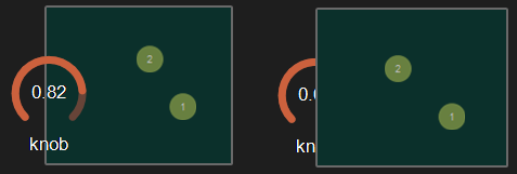
physics speed
The physics speed of the control in physics-engine.
init with random speed
When ON, the physics-engine starts with a random speed for each child controls.
same masses
When ON, all controls have the same masses in the physics-engine.
ignored in physical engine
The position control is not affected by the physics-engine.
friction
Friction factor in the physics-engine.
elasticity
Energy conservation coefficient on collision.
gravity x
Gravity factor on the X axis.
gravity y
Gravity factor on the Y axis.
reset pos x
Position of the object when the physics engine is reset on X axis.
reset pos y
Position of the object when the physics engine is reset on Y axis.
angular speed
Angular speed of the control in the physical engine.
collide
Sends a 1 value when the control collides with another control or a border.
collide info
Gives information about the collide state in the physics-engine.
- 1001: top of the parent,
- 1002: right side of the parent,
- 1003: left side of the parent,
- 1004: bottom of the parent.
speed x
Speed vector value on the X axis in the physics-engine.
speed y
Speed vector value on the Y axis in the physics-engine.
Layouts
auto reorganize
Automatically reorganize positions of controls in the panel.
reorganize margin
Left margin used in reorganization, in pixels.
reorganize interspace
Interspace between controls used in reorganization, in pixels.
auto resize
Resizes panels automatically when child controls are moved or resized. Switch it OFF if you use floating panels inside.
auto resize margin
Margin in pixel used for the auto resize option.
fit standard size
Adjust the panel width to a multiple of the default rack width.
snap to grid
In unlock mode, snap the control to a grid.
grid size
Grid size in pixels when snap to grid is ON.
toolbar
show toolbar
Displays the toolbar with its icons.
 Example ON and OFF
toolbar size factor
Height of the toolbar % of the global height.
 Example toolbar size on a panel.
See also
version 6.0.240115
Edit All Pages