Video Player Image
Load image files and send them as frames to the video output.
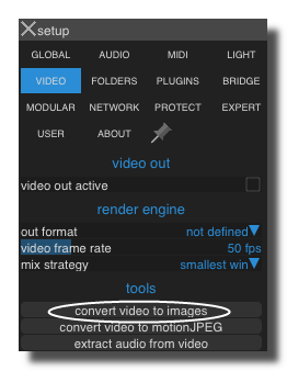
In the setup-panel-tab-video you can find a tool to export a video into separate frames as jpeg images: convert video to frames.
Settings
on
Activates or deactivates the module.
video out
Video output flow(s).
thumbnail out
Video output of the thumbnail image (reduced size).
video in
Video input flow(s).
show list
Shows the files list.
dimmer
Output intensity.
mode
Determines the way the files are read
- single file : only the selected file in the list,
- next file : when the file has finished reading the next file in the list is selected,
- previous file : when the file has finished reading the previous file in the list is selected,
- random file : when the file has finished reading a random file in the list is selected.
file number
File number combobox.
The numerical value corresponds to the selected file number in files list.
- -1: no file is selected.
- 0: the first file in the list is selected.
- 1: the second file in the list is selected
- etc.
number of files
Gives the number of files in the list.
rec
Records the video input flow and saves frames as separated images.
- The save folder is defined by the directory option. If the directory option is empty, Usine will use the default folder set in setup-panel-tab-folder.
- The saved file name has a prefix defined by the prefix option.
- If the option add to recorded image to list is ON, each recorded frame will be added in the images list.
- If the option use long filenames is ON, the filename of the recorded image will include the name of the current patch.
rec one frame
Records one input frame and store it in memory (no image is saved). It can be used to memorize a frame to reuse it later.
number of files
Gives the number of files in the list.
size reduction factor
Reduction size factor applied to the original size of the video.
- 1: no size reduction
- 3/4: reduction by 3/4
- etc.
This is useful to
- reduce the size of video and therefore reduce the CPU consumption of video filters,
- fit to the output display resolution.
This can reduce efficiently the number of pixels to process in the video flow and then reduce the CPU load of video effects.
A 1920 × 1080 (2073600 pixels per frame) video with a size factor of 2/3 gives a 1280 x 720 resolution (921600 pixel per frame) so the CPU load will be reduced by 50%.
fit aspect ratio to setup out format
Determines if the aspect ration must follow the settings of setup-panel-tab-video out format or not. When ON the image aspect ratio is adapted to the setup setting aspect ratio. When OFF the setup setting is ignored and the aspect ration is not changed.
width
Video resolution width (once reduction factor applied).
height
Video resolution height (once reduction factor applied).
limit image size
Limites the size of the output image.
Can reduce the CPU consumption if you try to display very hi resolution images.
next
Selects the next file in the list.
previous
Selects the previous file in the list.
next rand
Random selection of a file in the list.
first
Selects the first file in the list.
add recorded images to list
When ON, recorded images are automatically added to the file list.
prefix
Prefix added to the filenames when the images are automatically saved.
directory
Directory where the images are saved.
use long filename
Add the filename of the patch to the filename of the recorded image.
short filename
Gives only the name of the file, without the path and extension.
long filename
Gives the full name of the file, included the path.
add file name
Set this value with a filename to add a new file in the list (this applies to the sampler, video player and Piano-Roll).
See using-drag-drop.
list comma text
Input to set the file list with a comma-text.
clear list
Clears the files list. When you press saverand or savename the recorded file is automatically added to the files list. With the clear list button you can clear the list directly.
clear last
Deletes the last element of the files list
saved in preset
Determines if parameters of this object are saved in the preset-panel.
fade preset
Parameters of the this object can cross faded when you recall a preset in the grid.
Optional setting, does not appear on all objects.
Other Settings
hint
Hint text displayed on mouse over.

background
background color
Background color of the control.
transparent option must be OFF.
 Blue background color example.
transparent
Determines if the background of the control is transparent or not.
 Example, the first module is transparent.
hilited color
Background color when the control is modified by a remote (MIDI,OSC,etc.).
image file
Optional Filename of the background image.
Only PNG, JPEG and BMP formats are supported.
Use [ctrl+click] to reset.
 Example on an panel-xy-pad.
fit size
Force the image file to adapt its displayed size to the size of the object.
- proportional: the image keeps its proportion ratio and is left aligned,
- scaled: the image is scaled to the object size,
- original: keeps the original size
- clipped: the image is clipped to the object size, and centered,
- scaled: the image is scaled to the object size taking into account the border-size of the control.
Bitmaps
See manipulate-bitmaps.
bitmap in
Background bitmap input.
Use [CTRL + Click] to reset the input.
bitmap out
Background bitmap output.
border
show border
Displays or not the border of the control.
 8 pixels border on an panel-xy-pad.
border width
Sets the border width of the control in pixel.
8 pixels border on an panel-xy-pad.
border color
Border color of the control.
 a yellow border on an panel-xy-pad.
border OFF color
Border color when the control is OFF.
 a black OFF border on a switch.
border ON color
Border color when the control is ON.
a white ON border on a switch.
round size
Thickness of rounded corners.
0 = no rounded corners.
 Example on a panel-shape.
don't draw selection border
Enables or disables the drawing of a border when the control is selected with the mouse.
caption
show caption
Displays or not the caption.
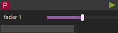
 Example on a fader.
caption align
Caption alignment of the control, left, center or right.
caption V align
Vertical alignment of the caption, center, top or bottom.
 Example on knob: Center, top and bottom.
 Example on switch.
caption font size factor
Size multiplication factor applied to the caption font.
 Example on switch.
caption font
Font name of the control caption.
 Example with 3 different fonts on switch.
caption font color
Color of the caption font.
 Example on switch.
caption font italic
Italic style for caption font.
 Example on switch.
caption font bold
Bold style for caption font.
 Example on switch.
caption font underline
Underline style for the caption font.
 Example on switch.
drag & drop
See using-drag-drop.
drag enabled
Enables the drag on this control.
allow drop
Enables or disables the drag&drop possibilities on this control.
drop file name
Name of the dropped file.
clear drop file name
Clears the latest dropped file name.
global
edition enabled
Determines if the control can be modified by the user. When OFF, the mouse interaction and modifications are disabled so the user can't change the value.
is visible
Sets or get the visibility of the control.
global color
Global color of the control. Usine will choose the best contrasted colors according the global color.
ignored in parent global color
When ON the global color of the control is not affected (is isolated) when the parent control global color changes.
snapshot name
Name of the snapshot (which contains the visual properties) loaded when the object is created. By default the snapshots files are located in /Resources/Snapshots/ or /Config/Snapshots.
the snapshot name can be without extension ie. LIGHT CLASS instead of LIGHT CLASS.tuknob_tab_design
on top
Determines the Z-order of the control
- normal: the Z-order is the control creation order
- on top: the control appears always on top of all other controls
- backward: the control appears always behind all other controls
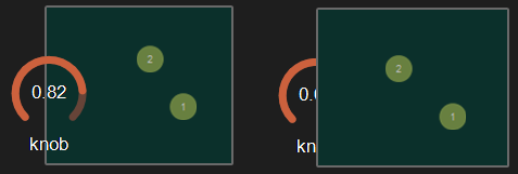 Example with the first knob on top.
opacity
Opacity value of the control.
0 will give a totally transparent control so invisible.
blur softness
Blur amount applied to the object.
 Example of blur.
Be careful, the blur softness use shaders which are not supported by all graphic cards.
It can crash Usine.
header
show header
Displays or not the header on the panel.
 Example on sequenced-lines.
header height
Height of the header in pixels.
header color
Background color of the header.
plain header
Determines if the header is drawn as a plain bar (HH5 style) or as small bar in the upper left corner.
 plain ON
 plain OFF
horizontal-scroller
show H scroller
Determines if the horizontal scroller is visible or not.
The scroller appears only if the container is smaller than the controls inside.
 Example of horizontal scroller
h scroller height
Height of the scroller in pixels.
h scroller color
Scroller color.
h scroller opacity
Scroller opacity.
ID's
visible only in god mode, see setup-panel-tab-expert.
unique ID
Current private id for this control.
recreate ID
If you experience difficulties in Polyphonic mode, try to recreate new id(s) with this button.
repair ID s
Each Patch shared on the local network uses its own ID (identification number). If you experience issues of Patches that don't send information to the good target, this button will rebuild all these id's.
info
show info
Opens the web browser to display information's or help about the selected object, if it exists.
For more details about information/help creation, see create-help-file.
location
where
Determines where the object is visible.
- invisible: the object is invisible.
- ctrl panel: in the control-panel.
- parent ctrl panel: in the control-panel of the parent patch if it exists.
- top ctrl panel : in the control-panel of the top parent patch (main patch) if it exists.
- container : in the container of the current patch.
- parent container : in the container of the parent patch of the current patch.
- top parent container: in the container of the top parent patch of the current patch.
- pop up window: visible in the popup.
- top header: visible in the top top-header-panel.
- toolbox: visible in the toolbox-panel.
- workspace: visible in the workspace-panel.
- additional container: visible in an additional container, identified by a number. See bellow.
When the location is set to a container which doesn't exist in the patch, Usine try to find in parent patches, the first container available. If no container is available an error message is displayed.
is additional container
Sets the control as an additional container so any other control can be placed into that container. The additional container is identified by a number.
 a button inside a listbox
also visible in IB
When ON, will also be visible in the interface-builder-panel.
Mouse
mouse dwn
Gives the mouse state of the control:
- 1 if the mouse is pressed
- 0 otherwise.
In multi-touch environment, can be an array of [0..1] values.
mouse wheel
Gives the mouse wheel speed and direction, -1,-2,-3,...=forward, 1,2,3,...=backward.
mouse wheel enabled
Enables or disable the mouse wheel action.
dbl click
Sends a 1 value if the user has [dbl-clicked] on the control.
mouse active
Determines if the mouse is active on the control.
mouse y
Gives the mouse X position on the control in relative coordinates from 0=most-left to 1=most-right.
In multi-touch environment, can be an array of [0..1] values.
mouse x
Gives the mouse Y position on the control in relative coordinates form 0=top to 1=bottom.
In multi-touch environment, can be an array of [0..1] values.
touch pressure
Pressure value on touch-screens.
The pressure value is not available on all touch screens.
gesture
Gesture information's.
In touch and multi-touch environment, returns an array of the fingers movements See multi-touch
auto reset
When ON, the value of the control is reset automatically on mouse up.
vertical mouse
When ON, move up-down to rotate a knob, left-right when OFF.
mouse over
Sends a 1 value when the control is hovered with the mouse.
mouse over
Sends 1 when the control is mouse overed.
selected
Sends 1 when the control is selected.
Size, positions
top
Top position of the control in pixels.
left
Left position of the control in pixels.
height
Height of the control in pixels.
width
Width of the control in pixels.
position x
Horizontal position in % [0..1] relative to the parent panel.
position y
Vertical position in % [0..1] relative to the parent panel.
heightpc
Height in % [0..1] relative to the parent panel.
widthpc
Width in % [0..1] relative to the parent panel.
iB top
Top position in pixels in the interface-builder-panel.
iB left
Left position in pixels in the interface-builder-panel.
iB width
Width in pixels in the interface-builder-panel.
iB height
Height in pixels in the interface-builder-panel.
rotation angle
Rotation angle of the control.
vertical
Rotates this control in vertical position.
zoom scale
Zoom scale of the control.
can zoom
Determines is the control can be zoomed with the wheel mouse.
resize grip enabled
Determines if the control can be resized with the resize grip.
minimized
Determines if the control is minimized or not.
floating x
Determines if the control is movable on X axis.
floating y
Determines if the control is movable on Y axis.
floating content parent x
When ON the control stays inside the parent on X axis.
floating content parent y
When ON the control stays inside the parent on Y axis.
TpgControl_Button.floating content parent y
resizable left
Determines if the control can be resized on its left hand.
resizable right
Determines if the control can be resized on its right hand.
resizable top
Determines if the control can be resized on its top hand.
resizable bottom
Determines if the control can be resized on its bottom hand.
Physics-engine
See physics-engine
physics enabled
Enables physics-engine in this panel.
physics speed
The physics speed of the control in physics-engine.
init with random speed
When ON, the physics-engine starts with a random speed for each child controls.
same masses
When ON, all controls have the same masses in the physics-engine.
ignored in physical engine
The position control is not affected by the physics-engine.
friction
Friction factor in the physics-engine.
elasticity
Energy conservation coefficient on collision.
gravity x
Gravity factor on the X axis.
gravity y
Gravity factor on the Y axis.
reset pos x
Position of the object when the physics engine is reset on X axis.
reset pos y
Position of the object when the physics engine is reset on Y axis.
angular speed
Angular speed of the control in the physical engine.
collide
Sends a 1 value when the control collides with another control or a border.
collide info
Gives information about the collide state in the physics-engine.
- 1001: top of the parent,
- 1002: right side of the parent,
- 1003: left side of the parent,
- 1004: bottom of the parent.
speed x
Speed vector value on the X axis in the physics-engine.
speed y
Speed vector value on the Y axis in the physics-engine.
Layouts
auto reorganize
Automatically reorganize positions of controls in the panel.
reorganize margin
Left margin used in reorganization, in pixels.
reorganize interspace
Interspace between controls used in reorganization, in pixels.
auto resize
Resizes panels automatically when child controls are moved or resized. Switch it OFF if you use floating panels inside.
auto resize margin
Margin in pixel used for the auto resize option.
fit standard size
Adjust the panel width to a multiple of the default rack width.
snap to grid
In unlock mode, snap the control to a grid.
grid size
Grid size in pixels when snap to grid is ON.
Toolbar
show toolbar
Displays the toolbar with its icons.
 Example ON and OFF
toolbar size factor
Height of the toolbar % of the global height.
 Example toolbar size on a panel.
See also
version 6.0.241021
Edit All Pages